
In this variation, the creature has many more eyes along its top side and only one bulbous sac. Honestly, I'm uncertain as to why I left this design alone. I think that what I was doing just evolved away from this design but I would like to see this creature taken further as if concealed and positined correctly, I feel it could be quite frightening.
I guess it is possible that because the creature is of unrecognizable form, rather than just being a giant cephlapod, that this lack of relation could make it harder to be frightened by it.

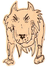
The splitting head was inspired by the design on this creature in the Silent Hill video game. (Apologies for the poor picture quality, this is a photograph I found of someones hand made replica of the creature. It is otherwise basically impossible to see online)
I chose to take inspiration from this creature because although you get to see it fully and thus ruin the fear of meeting it that the game works to build up through terrorfying tension, it's appearance is so alien and hostile when the thing lunges, trying to swallow you whole that it's almost as if what the creature actually looks like has managed to trump what your mind could ever concieve.
Still, the concept of visualising an 'unimaginable horror' as Lovecraft put it is a dangerous one because you really have to push the boat out on unexpected creature design. I don't have the ease of having my reader just imagine what the creature looks like by hiding them behind imageryless text like he did though.
Or do I? If I hide most of the creature that I display or just hint at it's existence, I think I will make for a much more human experience. Something that feels more real as the viewer is left to fill in the blanks.

To help me get a better grip on drawing the parts that I would reveal, I took sketches of other works on the Kraken.
This piece by Bob Eggleton caught my eye due to.. well.. the eye of the creature. Eggleton seems to have clicked onto the same stream as myself in that the eye of the creature, although harmless is a powerful tool of dominance and he utilizes the tentacles in the image to draw you into it.


This is the idea I was thinking of; concealing most of the creature so that the viewer deals primarily with only its terrible apendages. So, you can see why I would want to sketch off a little of this Pirates of the Caribbean concept art, though the name of artist eludes me.
What I like about this image I found is that the tentacle completely fills a quarter of the screen and is bursting out of the boundries that the picture provides, hinting at a larger size than actually seen. The artist has also made good use of a murky palette and mist to give a more hostile feel to the piece. If the Kraken attacked during the middle of a sunny day, it would probably LOOK less threatening than if it did when the rest of nature was also against you. I say LOOK specifically, because I know that if I was on a ship on the nicest day weatherwise in recorded history and we were attacked by a Kraken, that I would still have a heart attack very quickly.


And I chose to draw from fellow deviant artist 'Fenster' on his interpretation of the Kraken because he made it look so decrepid, beaten and down right unpleasant to look upon. This sickly beast with it's decomposing head and beady pearl-black eye are another good example of 'If you're going to show a creature, it might as well be the most disgusting mess of a creature that anyones ever seen'.
I've noticed what I've been trying to take away mostly from these drawings isn't the look of the creatures in them so much, but the positions in which they move about. I was trying to capture what as many artists as possible felt was the most natural LOOKING way in which this thing held itself in an image.


This is me just messing around with different looks for the creature and experimenting with how tentacles 'work' and coil and pool. I quite like the big tentacles shown here actually; their positioning makes them look convicing.

On the advice of Ollie, at this point I took a look at the work of Gezfry and their style of image making. By this point I was beginning to get a bit saturated with interpretations of undersea creatures so I just focused on trying to absorb information from their work on composition of images.
I went about this by very roughly sketching out a few of their pieces and then labelling using numbers where my eyes had fallen first, second, third and so on, showing the path around the image that my eyes had taken. I also took care to note if my eyes kept being continually drawn back to the same position due to a highlighted or centre-focused layout.
I apologise for the scan quality as its very faint here and also for the constant underlining in this paragraph. I messed about for a good few minutes trying to find someway to turn it off but Blogger has this annoying habit of believing it knows better than you what you want to appear on the page..


Above you can see how I considered splitting one large image into a triptych to emphasize the sheer scale of the creature I was trying to bring about. I quite liked this idea but I didn't feel that in this state, the concept was answering the brief of modernising a tale. It would be presenting elements of it sure, but not bringing it into this time.


So, with these lessons on composition fresh in my mind, I moved into the endgame stages of the project..
No comments:
Post a Comment